
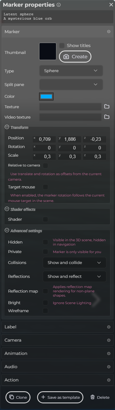
Marker
The Marker section controls the identity and appearance of the selected marker.
Use the thumbnail area to create or refresh a preview image. Use Type for marker style and Color for scene-visible color.
The Transform and Advanced settings groups are collapsed by default. Open them when you need more detailed placement or marker behavior options, and leave them closed when you only need to make a quick visual change.
 Steps: Expand markers section → Select the first marker in the list to open the properties panel → Open the Marker section → Expand all collapsed fieldsets in the Marker section
Interface elements
| Element | Details |
|---|---|
 | Thumbnail Create the thumbnail for the marker. |
 | Type The visual type or shape of the marker. |
 | Split Pane Assign this marker group to a split-view pane. |
 | Color Pick the color for the marker. |
 | Texture Choose an image to use as texture. |
 | Video Texture Choose a video to use as texture. |
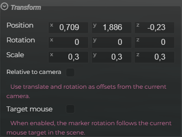 | Transform Settings Modify the marker transform. |
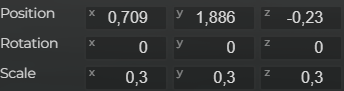 | Transform Modify the translation, rotation and scale. |
 | Relative To Camera Use translate and rotation as relative offsets from the current camera. |
 | Target Mouse When enabled, the marker rotation follows the current mouse target in the scene. |
 | Shader Custom shader settings. |
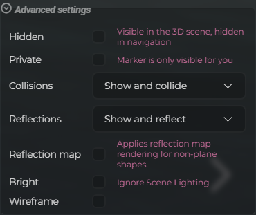 | Advanced Settings Configure the more advanced settings. |
 | Hidden Hide the marker in menu and other navigation components. |
 | Private The marker is only visible for you. |
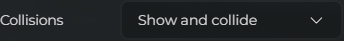 | Collisions Choose if the shape is used for visuals, collisions or both. |
 | Reflections Choose if the marker reflects in mirror and water surfaces. |
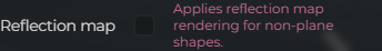 | Reflection Map Whether a lightweight reflection map is used instead of a real reflection (uses fewer resources). |
 | Bright Ignore scene lighting, uses a bright color instead. |
 | Wireframe Show the shape as a wireframe. |