Scene Layout, Styling & Marker Navigation
Layout settings let you adjust the visual finish of the scene and viewer elements. You can also activate and style several marker navigation controls here.
LCC viewer
 Steps: Expand scene settings section → Select the Styling scene section → Expand all collapsed fieldsets
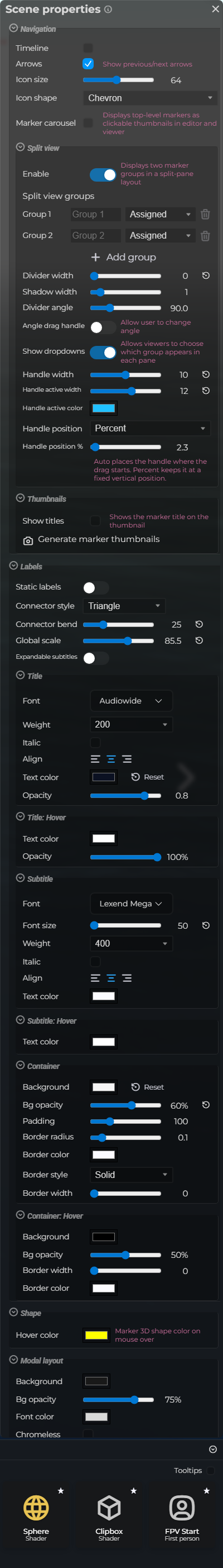
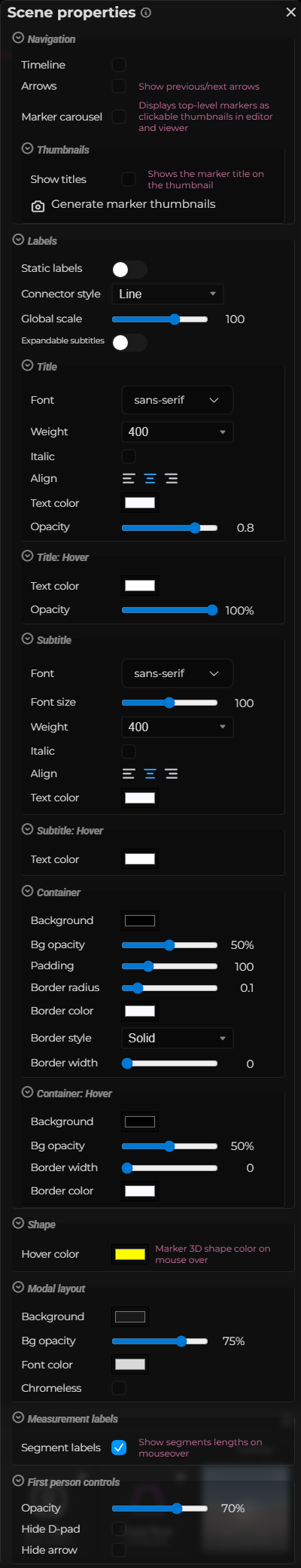
Interface elements
| Element | Details |
|---|---|
 | Marker Timeline Show a timeline bar that lets viewers scrub through markers in sequence. Default: Off |
 | Marker Navigation Enable arrow buttons for navigating between markers without using the marker list. Default: Off |
 | Navigation Size Set the size of the marker navigation arrow buttons in pixels. Default: 64 |
 | Navigation Icon Choose the icon style used for the marker navigation arrows. Default: ti ti-chevron |
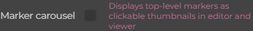 | Marker Carousel Show a scrollable thumbnail carousel of markers at the bottom of the viewer. Default: Off |
 | Static Labels Pin all marker labels to a fixed position on screen instead of floating in 3D space. Default: Off |
 | Connector Style Choose whether the line connecting a label to its marker is a straight line or a triangle shape. Default: line |
 | Connector Bend Control the curvature of the triangle connector between labels and their markers. Default: 0 |
 | Label Scale Set the global size of all marker labels in the scene. Default: 100 |
 | Editor Scene Properties Styling Label Expandable Documentation for Editor Scene Properties Styling Label Expandable. |
 | Header Font Choose the font family used for marker label titles. Default: sans-serif |
 | Header Font Weight Set the weight (thickness) of the label title font: 200 (thin) to 800 (heavy). Default: 400 |
 | Header Italic Render the label title text in italic style. Default: Off |
 | Header Text Align Set the horizontal alignment of the label title text: left, center, or right. Default: center |
 | Header Text Color Set the default color of the label title text. Default: #fbfbff |
 | Header Opacity Set the transparency of the label title text. Default: 0.8 |
 | Header Hover Color Color of the label title text when the viewer hovers over the label. Default: #ffffff |
 | Header Hover Opacity Opacity of the label title text when the viewer hovers over the label. Default: 1 |
 | Body Font Choose the font family used for the label body text. Default: sans-serif |
 | Body Font Size Scale the body text relative to the header font size, from 50% to 150%. Default: 100 |
 | Body Font Weight Set the weight of the body text font: 200 (thin) to 800 (heavy). Default: 400 |
 | Body Italic Render the label body text in italic style. Default: Off |
 | Body Text Align Set the horizontal alignment of the label body text: left, center, or right. Default: center |
 | Body Text Color Set the default color of the label body text. Default: #fbfbff |
 | Body Hover Color Color of the label body text when the viewer hovers over the label. Default: #ffffff |
 | Background Color Set the fill color of the label background container. Default: #000000 |
 | Background Opacity Set the transparency of the label background container. Default: 0.5 |
 | Padding Set the inner spacing between the label text and the edge of the background container. Default: 100 |
 | Border Radius Set the corner rounding of the label background container. Default: 0.1 |
 | Border Color Set the color of the label container border stroke. Default: #fbfbff |
 | Border Style Choose the border stroke style: solid, dotted, or dashed. Default: solid |
 | Border Width Set the thickness of the label container border stroke. Default: 0 |
 | Hover Background Color Background color of the label container when the viewer hovers over the label. Default: #000000 |
 | Hover Background Opacity Opacity of the label container background when the viewer hovers over the label. Default: 0.5 |
 | Hover Border Width Border thickness of the label container when hovered. Default: 0 |
| Hover Border Color Border color of the label container when hovered. Default: #fbfbff |
 | Shape Hover Color The tint color applied to marker shapes when the viewer hovers over them. Default: #ffff00 |
 | Modal Background Background color of the marker detail modal dialog. Default: #191919 |
 | Modal Opacity Opacity of the marker detail modal background. Default: 0.75 |
 | Modal Font Color Text color used inside the marker detail modal dialog. Default: #d9d9d9 |
 | Chromeless Hide all modal chrome (background, border, header, close button) and show only the HTML content. Default: Off |
 | Show Measure Segments Display intermediate segment labels on measurement markers. Default: On |
 | Controls Opacity Set the transparency of the first-person movement controls overlay. Default: 0.7 |
 | Hide D-Pad Image Hide the D-pad directional control image from the first-person controls overlay. Default: Off |
 | Hide Up Arrow Image Hide the upward movement arrow from the first-person controls overlay. Default: Off |
Split view
| Element | Details |
|---|---|
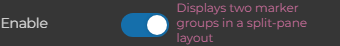 | Enable Show two scenes side by side with a draggable divider. Default: Off |
 | Divider Width Visible divider line width in pixels from 0 to 10. Default: 1 |
 | Shadow Width Divider glow and shadow width in pixels from 0 to 10. Default: 1 |
 | Divider angle Directional angle of the split divider from 0 to 359.9 degrees (90 keeps the vertical split) Default: 90 |
 | Angle drag handle Show drag handle to allow the user to rotate the angle Default: Off |
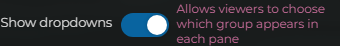 | Editor Scene Properties Styling Split View Show Dropdowns Documentation for Editor Scene Properties Styling Split View Show Dropdowns. Default: On |
 | Handle Width Handle width in pixels from 0 to 20. Default: 0 |
 | Handle Active Width Handle width in pixels from 0 to 20 while dragging. Default: 4 |
 | Handle Active Color Optional override for the active split-view handle color in the viewer. Default: #20c0ff |
 | Handle Position Choose whether the handle stays at a fixed height or starts where dragging begins. Default: auto |
 | Handle Position % Vertical handle position as a percentage from the top. Default: 2.3 |